Designing Interactive Children's Books
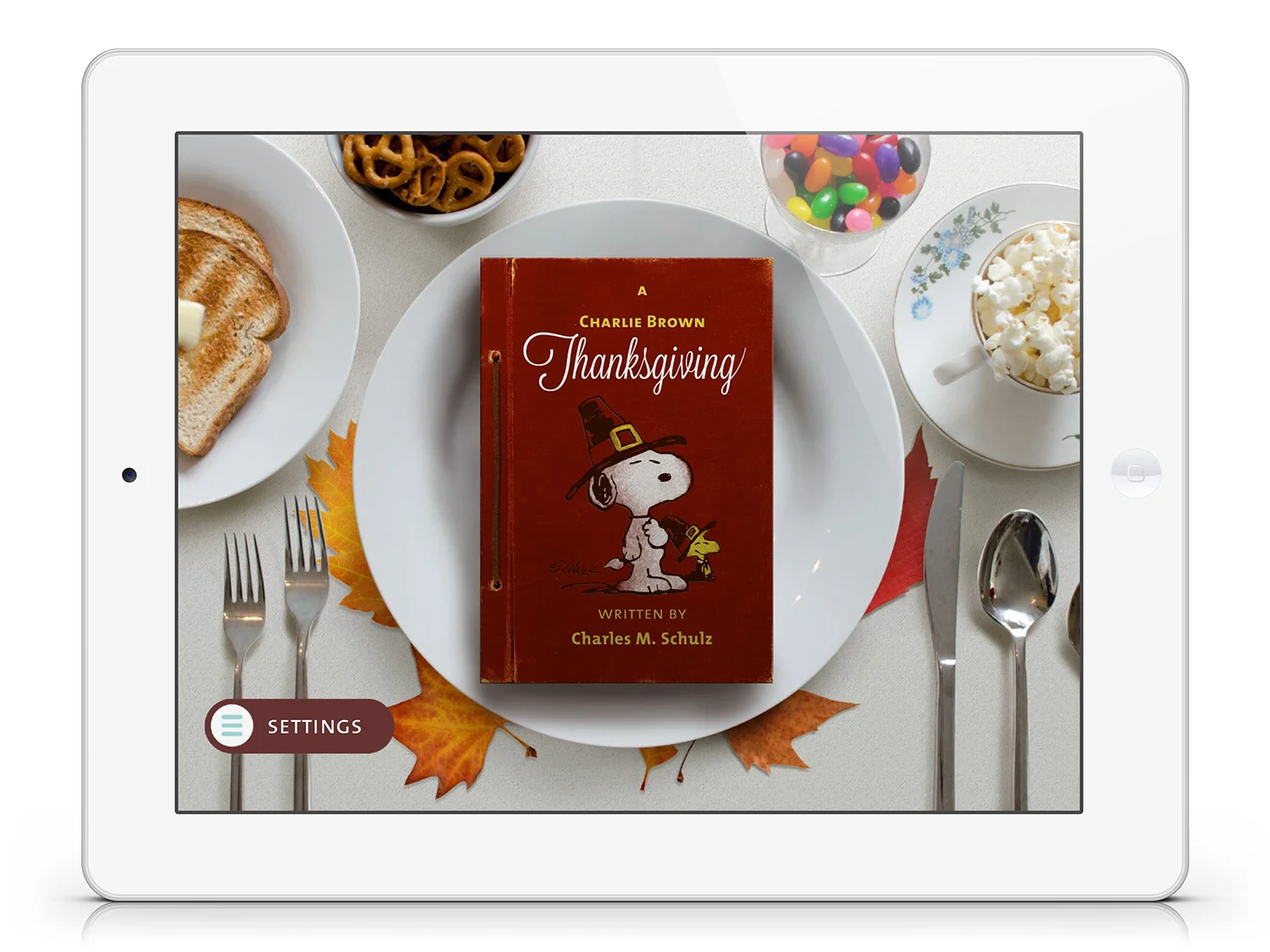
Charlie Brown's All-Stars and Thanksgiving
Introduction
Imagine designing an app or website for someone that:
- Can barely read.
- Can barely use their hands or point at objects.
- Has no mental model for interaction and very little experience with software.
- Gets bored and wants to give up every seven seconds
- Has no personal motivation, incentive to learn and is essentially lazy.
Designing an interactive book experience for early readers (3 to 6 year-olds) is surprisingly complicated. It's about as easy as designing an app for a hermit that lives in the woods. Naturally, we made a lot of mistakes along the way.
Loud Crow Interactive made a splash in the App Store early on by adapting old media into interactive books. They were the equivalent of pop-up books for mobile devices —featuring simple touch interactions, animations, voice over and music. The combination of brand recognition, novelty, and ‘feature-ability’ (support from the Apple editorial team) lead to their overnight success with two key products: Peter Rabbit and A Charlie Brown Christmas.
I was brought in during their second/third year, and designed two additional Charlie Brown books. It was an illuminating experience, and we learned some tough lessons. While I was there, the company made some unforced errors.
- An overemphasis on making the same products, faster and cheaper.
- Not enough user-testing, and general overconfidence in their early product design.
- An over-reliance on licensing large IP — without considering the cost and difficulty of adapting certain styles of content.
- Overcommitment to licensors.
It’s hard to discuss the design decisions of a single product. As a designer on an existing product line, my job wasn’t to change the products wholesale — it was to make the best design decisions I could to streamline production, while improving the user experience and overall quality of the products whenever possible.
When you churn out 14 apps over the course of two-and-a-half years, with limited time and resources, you are going to accumulate design debt. So while the products matured and improved under my watch, those improvements happened over the course of many releases.
Turning a Television Special into a Fake Book
Here are some of the challenges of adapting a classic Charlie Brown television special from the 1950's and turning it into a touchscreen book experience.
- Not having access to original artwork or the artist and rebuilding artwork from scratch.
- Adapting a half-hour of animated story content — or 30-page script — into a reading experience appropriate for early readers.
- Introducing light, interactive elements to distinguish the product from a book or cartoon.
- Preserving and honouring the essence of the original.
The original design strategy the founders took to address these issues included:
- Licensing and reusing the original voices whenever possible.
- Introducing a tab system for text, so more content could fit onto a single page spread or scene.
- Outsourcing and limiting the re-creation of assets, and limiting the animation to simple pose changes.
Final moments from A Charlie Brown Christmas.
Making Navigation More Meaningful
One of the original problems was the tab system made the book feel tedious and monotonous, with very little benefit to the user. For instance, a reader might have to swipe through four or five tabs of copy before they saw any on-screen consequences. It felt like you bearing with the story, rather than advancing it.
For Charlie Brown's All-Stars, I wanted to make the action of swiping tabs feel more dynamic, purposeful, and integrated into the reading experience. Because there was more action in the All-Stars — there are long sequences where the gang plays baseball — we tied the shot transitions and simple animations to the dragging of the tabs. This allowed the reader to manipulated the pace of animation while controlling the pace of reading, and reveal 'the hidden frames’ or transitions between two shots.
Linking shot transitions to the tab swipe make the act of reading feel more dynamic; like scrubbing a playhead through a timeline.
The First Usability Tests
Even though the products themselves where getting more polished and sophisticated, sales in the book app market began to lag. Large publishers like Disney and PBS had entered the market, as well as a host of copycats and cheaper products.
To learn more about how consumers were using our current and upcoming products, I organized the company's first (ever!) playtest at Science World. We observed over forty children, from ages 4 to 10 play with various apps while we observed and made notes.
This, in conjunction with tracking how the apps were being used with Flurry Analytics, gave us insight into the products we never had before.
What we learned from playtesting:
- While a great deal of effort was put into making the experience as tactile as possible, it wasn’t obvious enough to young users.
- The tab system, while necessary for certain products, wasn't intuitive enough.
- The less the story experience resembled a actual book, the less inclined children were to actually touch the screen and play with the product.
- Interactive books seemed most popular with girls in the 6 to 7 range, transitioning from picture books to prose.
- The length of some books, in particular the Charlie Brown products, was simply too long for readers under six years old. A very small percentage of young readers reached the end of the story.
It's very hard to predict the dexterity of very young children. This girl is literally all thumbs.
Key Design Decisions:
A Charlie Brown Thanksgiving
In addition to addressing these design issues, I was tasked with cutting the production time of the newest Charlie Brown Thanksgiving product in half.
With this goal in mind, I adopted the following design strategy to improve the user experience while reducing the cost of production overall.
SKEUOMORPHIC DESIGN
We redesigned the look and feel of the UI to be as skeuomorphic as possible. We noticed young children were more inclined to touch and engage with objects on-screen when the product looked more book-like (Peter Rabbit), versus a still from an animated film.
The theory was that if the screen looked too much like an video, users were less inclined to actually explore or play with the screen unprompted.
LEFT: Visual target.


NAVIGATION TUTORIAL AND REVISED TAB SYSTEM
Due to the length of the story, the tab system was unavoidable. So we improved it in whatever way we could. We replaced the tabs with an arrow and a draggable 'ribbon'. We gave the ribbon a hit/drag state and added swipe hints if the user idled too long on a page.
By separating the copy from the tabs, we were able to improve the size and legibility of the typography, and minimize the amount of real estate the old navigation system occupied.
Finally, we integrated a brief tutorial in the opening title spread.
ABOVE LEFT: Video of title page and introduction to the book.
BELOW LEFT: Some of the original wireframes. Drop caps were introduced to signify the beginning of a page, and dozens of layouts were generated to test the versatility of the new system.
MORE PHYSICS-BASED EFFECTS, LESS KEYFRAME ANIMATION
I redesigned how characters should be redrawn and created new guidelines for the construction of art. By separating out the characters into limbs and large masses, we could rig them to behave more like paper dolls, making them responsive when the device was tilted or touched.
This ‘ambient animation’ provided an important visual cue — because the characters moved like dolls, children were more inclined to try to touch them. Rigging the characters was also a cheap way of adding depth and life to the illustrations, without having to animating everything with key frames.
Greater emphasis was also put on using tilting effects to make the scenes themselves feel the viewer was peering into a diorama or shadow box.
STORYBOARD EVERYTHING, EVEN THE 'OBVIOUS'
Up until A Charlie Brown Thanksgiving, products were very loosely 'storyboarded', consisting of a screenshot with some light description of what was supposed to happen. While that is a fine strategy for someone doing everything themselves, it lead to a lot of miscommunication, wasted effort, and just mediocre work when coordinating other people.
I provided thumbnail storyboards for all pages, in order to identify all the assets, animation and scripting requirements. This helped define the scope of work up front, and allowed our designers, contractors and scripters to work simultaneously. A designer could composite and animate one spread, while a scripter could greybox another and get ahead during production.
This storyboard illustrates Snoopy cooking popcorn. A pull tab allows Snoopy to spawn popcorn. A pan appears on the next tab filled with kernels, which the readers can touch to pop. Finally, the pan explodes.
Post Mortem, Moving Forward
Charlie Brown Thanksgiving may be the most polished product of its series, despite being built in the least amount of time. After testing the product after we learned another tough lesson — having too many touchable objects on-screen at once made it harder for very young children to navigate the books on their own. Despite our best efforts, they simply didn't have the finger dexterity or accuracy to consistently control an interface that relies on dragging or swiping.
Over the course of three years, Loud Crow had unwittingly developed a flawed product — an app with light interactions for very early readers and lengthy, complex stories for 6 to 7 year olds. Knowing this led to radically simplifying future products, steering away from long adaptations to focus on developing content that was shorter and sweeter for younger audiences.